Branding for the LPG stations network

Well-built business processes, service, cleanliness, perfect order – these are the essence of the Vremya Gaza brand. At each station the client may take a stunning coffee and wait for his car in a comfortable client zone. The identity reflects this atmosphere of care, as well as fire in the hearts and drive of those peoples who work for the company.
From pens to
box branding
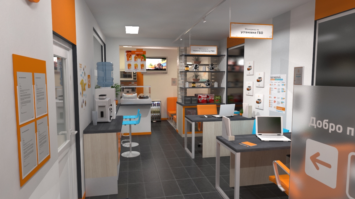
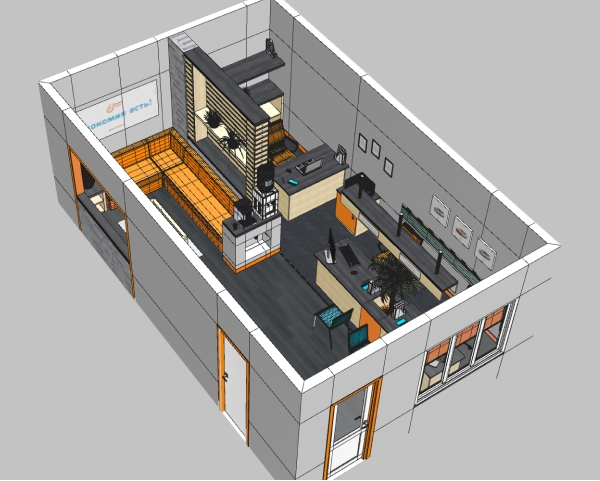
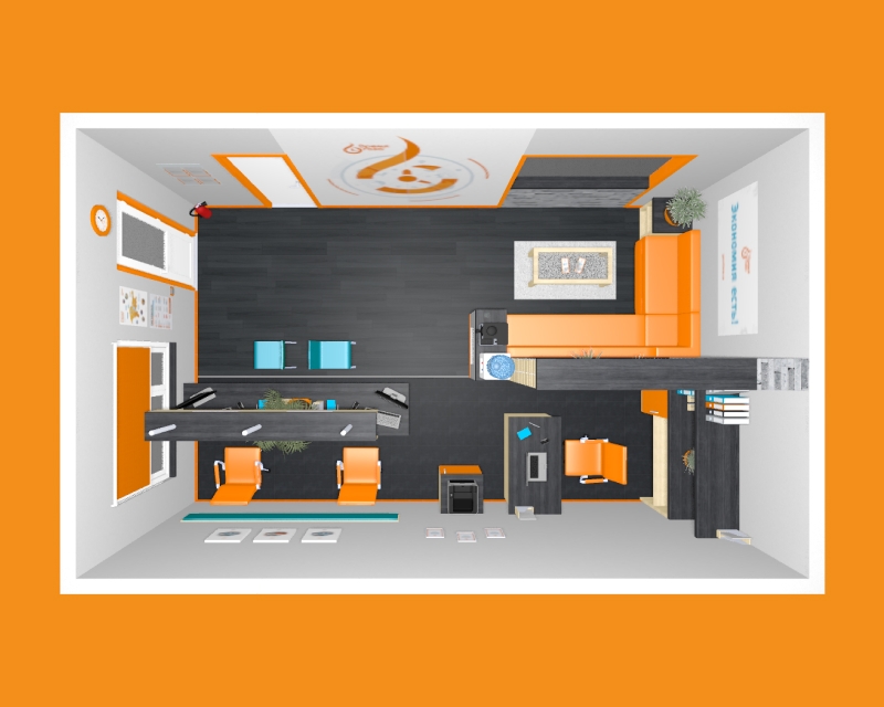
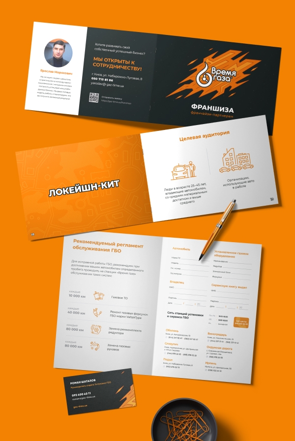
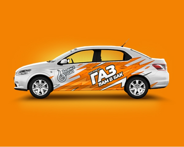
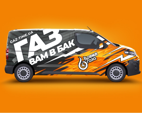
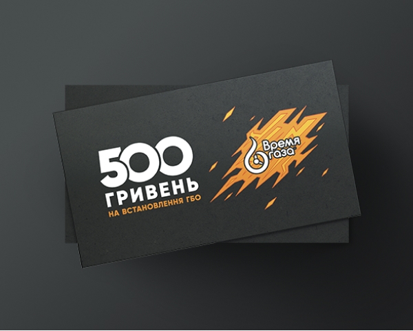
The Vremya Gaza branding is one of the largest with more than 300 different points of use. These are stations, cars, banners and posters, brochures, service books, stickers, advertising layouts, business cards, uniforms, etc. This list is constantly expanding in new vectors where a brand presence is needed.
Space ergonomics is built around the comfort of employees and visitors
3D visualization helps to make sure that everything is comfortable, on its place and in the same style
We support identity in printed materials, graphics and digital
"Gas to your tank" is an unofficial slogan invented by the Vremya Gaza team
Andrew
Art Director
The corporate identity evolves with the brand
Over the ten years that Vremya Gaza has been our client, we have seen the growth of this business from a few garages to almost ten stations in Kiev and the region. The warm and lamp-like corporate identity that we created in a far 2012 has changed with the business to reflect the values of the company. It's an exciting adventure to watch the visual evolution of a brand. Do you know what's even more exciting? Be a part of this transformation.
Do you have a similar
task?
LET'S DISCUSS