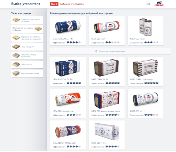
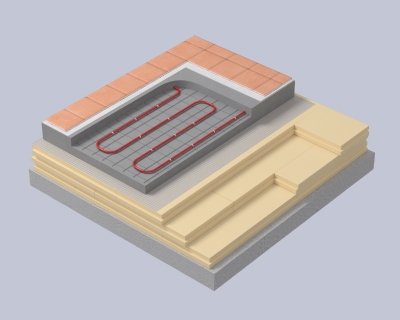
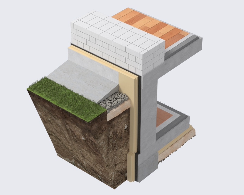
Our task was to shorten the user's path through the site to a specific product
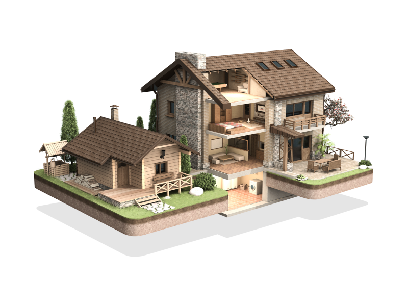
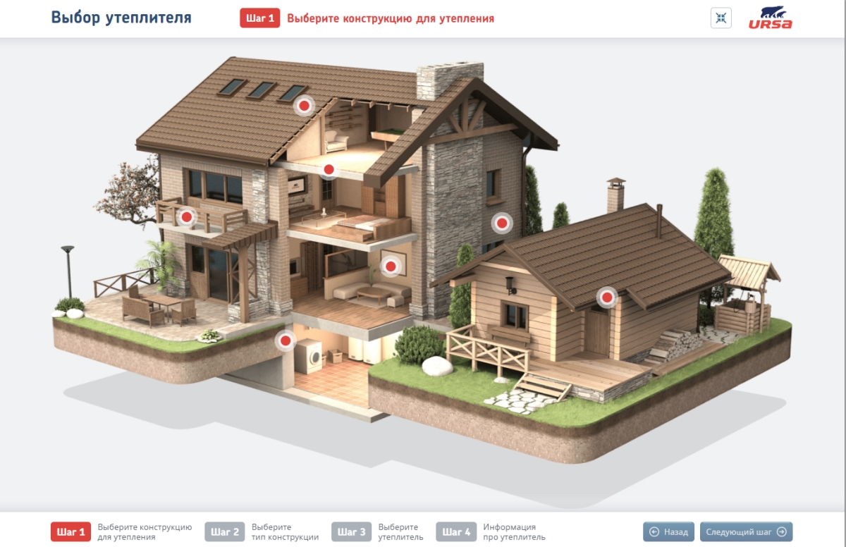
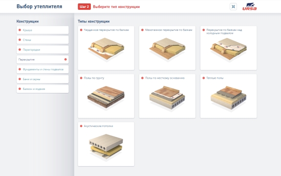
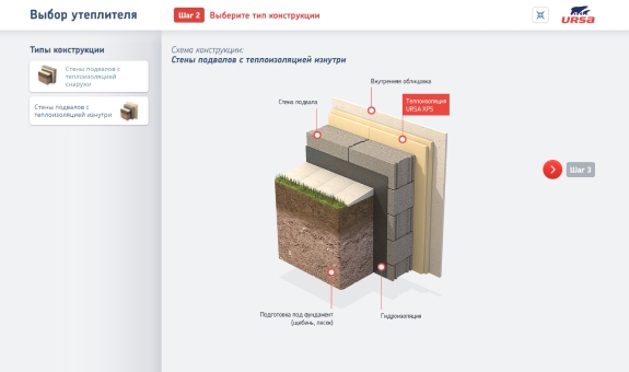
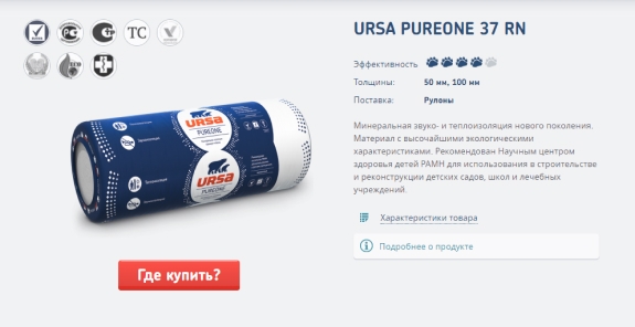
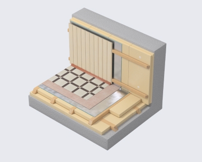
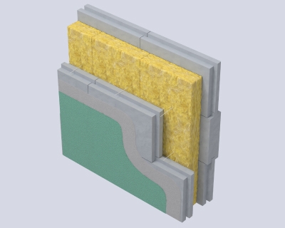
Yes, the site has sections by application industries. But the user, firstly, might not immediately understand the difference between the partitions and ceilings, and secondly, he had some problems with switching between products. Therefore, we decided to visualize the entire product map with an entry through the using. Now all constructions are clearly visible, products can be seen in one screen and compared.
